

Convene
People have difficulties organizing a time to meet up with friends in a casual or formal manner due to time constraints and scattered availability. Convene is a free platform which blends the intuitive UX aspects found in products like When2meet and Google Calendars. Convene is great to use for quick & casual meetups, but it's also useful for creating more formal kind of events. By designing a both compact and accessible interface, I feel that anyone can use it.
Role: Visuals, Interactions, Research
Timeline: 12 Weeks

Kickoff:
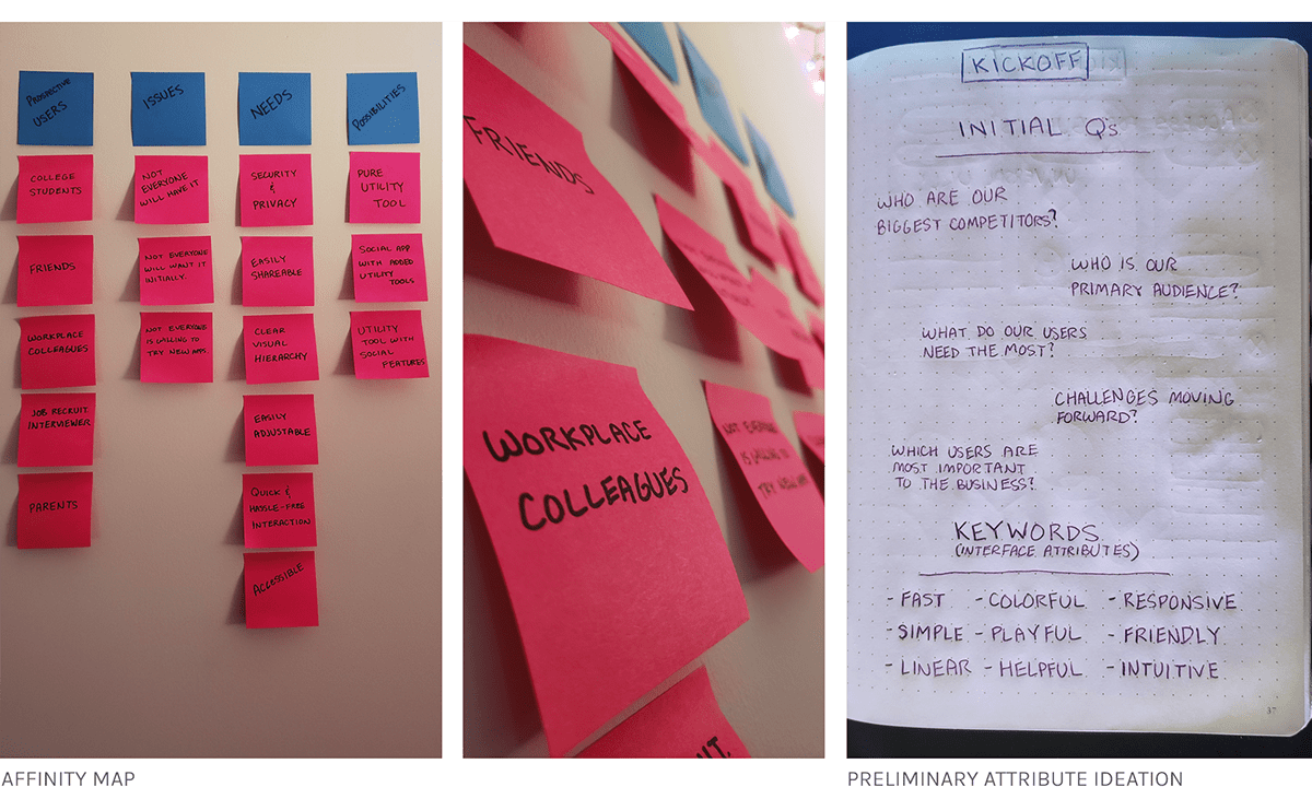
In Convene's design process, I opted for a goal-directed design approach that helped me move along through the timeline smoothly. Qualitative research methods proved to be the most effective during my design process, most notably my user interviews and usability testing sessions. Whenever I encounter an issue that I was trying to solve, it's smart to build a good foundation. In Convene's case, I did this by asking some generic but useful internal questions.
"Is there domain specific knowledge to know? "
"Who are our biggest competitors?"
"What are the challenges we will face moving forward?"
"What do our users need the most in a product like this?"
"Who is our primary audience?"
"Which users are most important?"
Preliminary Ideation:
I used affinity mapping to identify not only the general scope of Convene, but to decide which direction I wanted to take the product. This was a form of brainstorming during my kickoff period that proved to be very helpful in setting up the foundation for the rest of my process.
Research Insights:
I conducted a user questionnaire to gauge event-planning impact on people in terms of convenience, as well as which part they played during the planning process itself. These are the highlights of the insights I discovered when working through the questionnaire results and feedback.

Users:
1. Lia (20) (University Student | Organized | Hard working | Leader)
As much as Lia loves group projects in college (she doesn’t), she has a difficult time getting her group members to meet together outside of class to study. Rather than sending 20 text messages to figure out when everyone can meet, she would rather her group members respond with the times they are available. She needs something that doesn’t require much effort in order to get any response.
2. Ian (22) (University Student | Procrastinates | Forgetful | Follower)
Ian claims to hate group projects, but people hate group projects because of people like Ian. She waits for someone to organize a meeting time to study with the group and doesn’t contribute to the conversation. Regardless, he needs an easy way to convey his availability to his group members in order for them to setup a meeting time.
Key Path Scenarios
Most of the time, products tend to usually just have one primary key path scenario. However, I identified two key path scenarios when using Convene. One the user will experience as while planning an event or get-together, and the other when participating an event that the user didn't create themselves.
The scope of the product allowed me to focus more on these two pathways as there aren't any notable validation scenarios other than entering a familiar settings screen.

Creating a Framework
To better understand how I would construct the core experience for Convene, I designed a user flow. This helped me focus more on the experience and needs of the user and less so on the details that I would solidify later on. It also allowed me to communicate the entries and exits more clearly so I would have a better understanding moving forward.

Lo-fi Ideation:
Working through a couple really preliminary sketches, I realized some of the ideas and layouts that I was thinking of just wouldn't work. Not only was I able to quickly mark down some of the ideas I had but also able to take them and spark more ideas as well as quickly filter the good and bad ideas out.


Preliminary Wireframes:
Creating a higher fidelity but still fairly preliminary version of our wireframes, I was able to workout some of the technical issues that would not be viable in Convene, as well as tone down our "blue-sky" screens into more realistic ones. It was important for me to start big and scale down so that I could work around the features that I really wanted to have, rather than working upwards and maybe missing something that would've been really cool to see as a user.

Final Designs:


1. Start: The first screen you see as a Convene user. By tapping the fingerprint on the screen, you begin to plan your meetup.
2. Create: Here the user will name their event as well as add any details to it such as a photo, note, or location.
3. Pick a Day: The user may then select up to a seven-day time span for their participants to input their availability.
4. Select Free Time: You have the option to input when you are available before sending it out to your participants so they know the dates & times when you are free.
5. Overview: Before creating the event, you are given a summary of everything you've selected so far. This helps in reducing the need to recreate the event entirely if a mistake is made.
6. Availability Hub: The screen that both your participants and you see. Take the Convene link, and send it to your participants! As they input their availability, the screen updates in real-time to ensure an accurate reading at a glance.
Style Guide:
Using matching playful tones of color with calm and relaxing white/blues, I was able to sell the identity of Convene as a playful, laid-back, intuitive application. I utilized color sparingly throughout the app to convey which elements were intractable and should be paid attention to within the product. I also opted to use the typefaces Roboto and Karla within the interface as they played the pivotal role of matching the laid-back environment we had built in Convene's interface.

Takeaways:
Convene as a concept is something that I feel society would greatly benefit from. The current options and tools out there to perform the same task don't cut it. The primary difficulty I had while designing this product was the task of creating a screen that could display up to a maximum of 24 hours a day, 7 days a week, for everyone. I feel that although there may be a better solution out there, I designed an experience that works well for most users.


